#SHUTTERUP Branding Identity
A branding identity redesign for my high school's student photography and graphic club.
Duration
2018
Client
Bùi Thị Xuân Photography And Graphics Club
Services
#
Design

Overview
Created to replace a problematic old logo with something original, youthful, and more aligned with the club’s creative spirit.
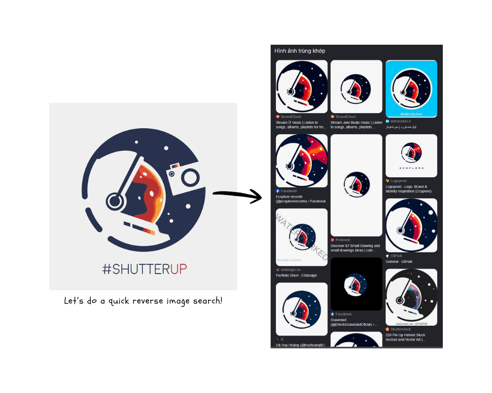
The Problem
The previous logo had plagiarism issues, so the club needed a new identity that was both legally safer and more reflective of its creative community.
Research
I looked at the club’s role as a space for photography, graphic design, and student-led art activities. The new identity needed to feel youthful, expressiveI looked at the club’s role as a space for photography, graphic design, and student-led art activities. The new identity needed to feel youthful, expressive, and flexible enough to work across posters, social media, and club communication., and flexible enough to work across posters, social media, and club communications.
Discovery
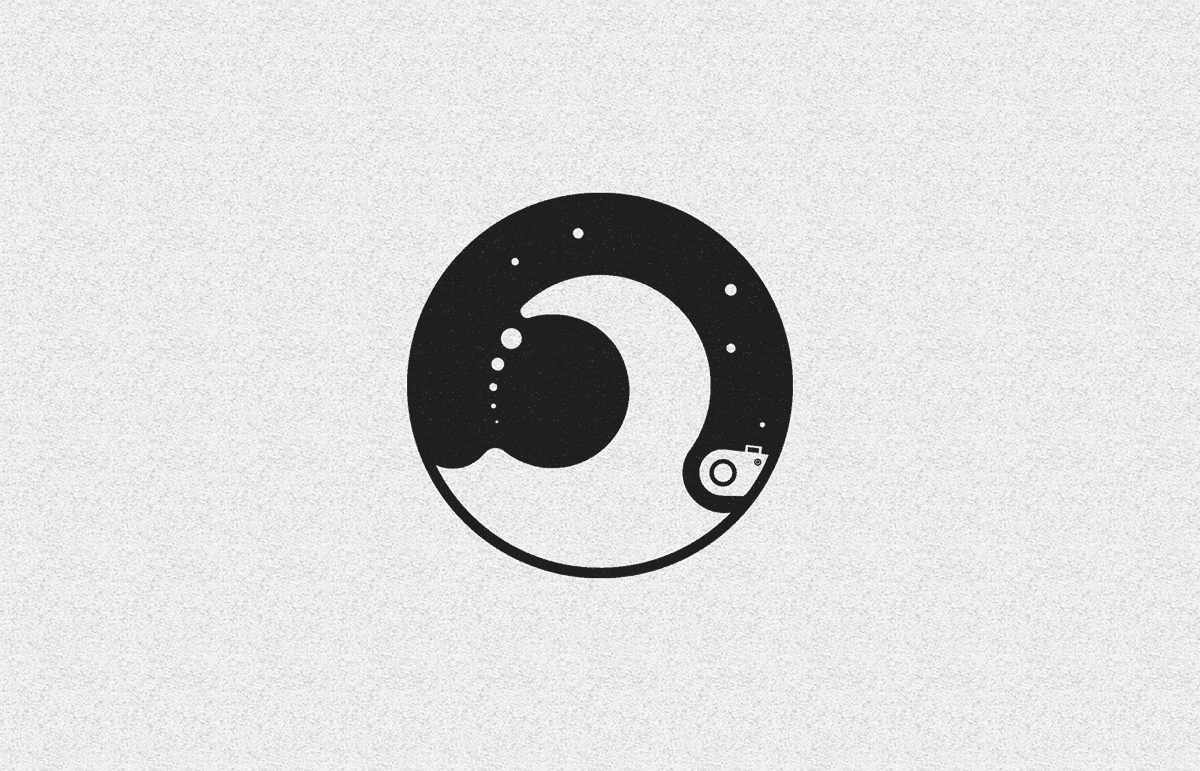
What the club needed was not a literal photography symbol, but a mark with stronger character and memorability. I chose to work with the idea of an astronaut as a symbol of curiosity and exploration, then simplified it into a more abstract form while keeping it recognizable.
Design Process
I redesigned the identity around an abstract astronaut-inspired logo, focusing on clarity, originality, and easy application across different brand touchpoints. The goal was to make the mark distinctive enough to stand on its own, while still feeling playful and fitting for a student creative club.
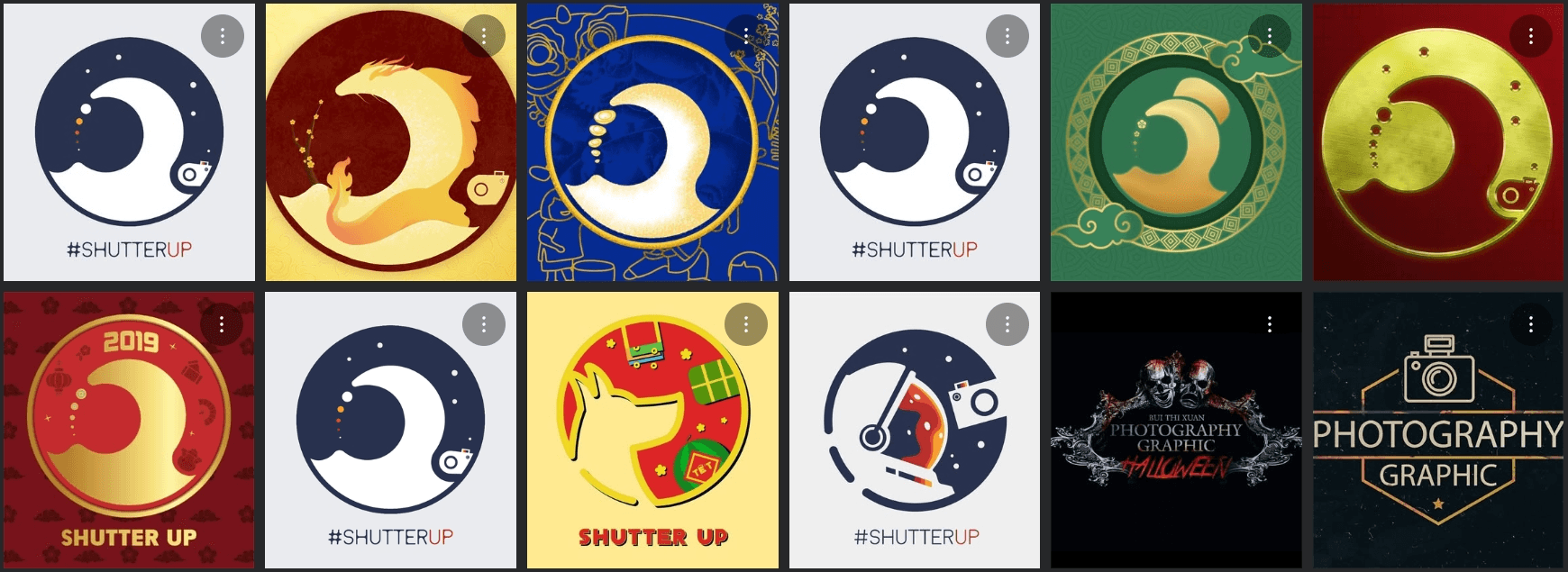
Another goal was to create a logo system that high school students without professional design experience could easily modify for seasonal campaigns.
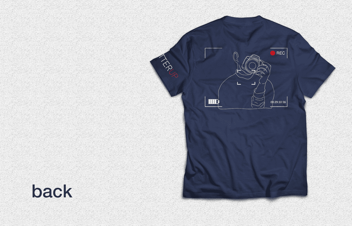
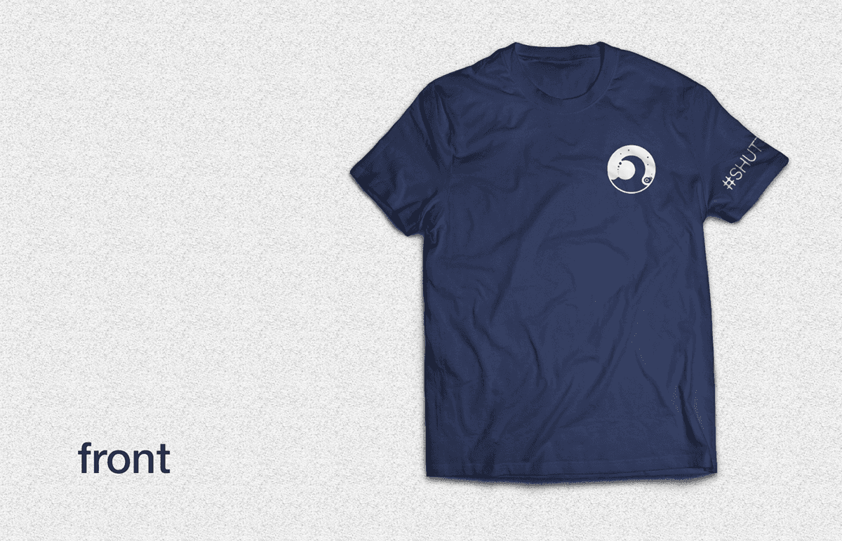

Final delivery
The delivery of the new identity was successful as it received very positive feedback from students across the school, which helped confirm that the redesign felt fresh, appealing, and much more fitting for the club.